You’ve accomplished what is possibly one of your nonproifit’s most important tasks. You’ve attracted a donor.
They’ve visited your website. They’ve read your materials. They’ve seen your photos, watched your videos, and listened to your talking points. After all this, they are convinced. They have decided that your nonprofit, your team, and your goals are worthy of their hard earned money.
Thus, they’ve clicked the button marked “I’ll help”, “Give now”, “Donate today”.
Yet a minute or so later, no money has changed hands. No payment information was provided. No donations were made.
Why?
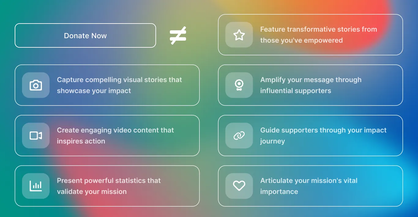
Exact reasons are hard to come by, but Everfund can offer some rules of thumb can be useful here. There’s a selection of big red flags, turn offs, and general mistakes that get made with what is shown in the moment after a potential organisation clicks “donate now”. Here are nine of the most common examples nonprofits should be avoiding, some specific reasons why these things are a bad idea, along with the one piece of foolproof advice about what should happen once someone clicks the “donate now” button.
1. Pretty pictures and/or photos
Everyone loves good artwork, and doubtless your non profit has a smattering of photogenic staff members or relatably normal looking types who can look inspiring when doing notably abnormal acts of charity. However, in the moment of donation, your web visitors are less interested in stylish snaps and pretty pictures than in the direct mechanisms of donation.
2. Videos and adverts about your cause
If a picture can paint a thousand words, how many more words could be conveyed by the digitally mobile canvas of a video. Stylish editing and impressive graphics can come together well to make something very impressive for many moments. But in that finite donation moment, it is entirely the wrong time to be making people watch even the shortest of short clips or videos.
3. Useful statistics and factiods
The cause your non profit is working to support doubtless has an arsenal of informative data at its disposal. Everything from the horrifying spike in black cat abandonment in October to the glut of polysyllabic words spat out in important local authority tenancy agreements. However, details like this, convincing as they might be, are not called for when someone has offered to donate.
4. Quotes from members of staff
Your staff members could well be Shakespeares in the making, just waiting for their time to elquently elaborate on the merits of your cause. Yet their veritable verbosity might well be better bandied about somewhere other than the immediate aftermath of clicking “donate now”
5. Quotes from those your nonprofit has aided/saved/empowered/helped/supported
By its nature, the nonprofit sector is awash with generous souls who rightly deserve praise for the work they do for the cause. Equally plentiful are the thankful ones who have benefitted from their kindness. But, when someone has clicked “donate now” that isn’t what they need to read about.
6. Quotes from celebrities/prominent figures who support your cause
Many causes recieve patronage from all different kinds of people, with all different kinds of interest, for all different kinds of reasons. Some of which might be supporting your charity. You might well think their words carry weight. You are indeed right. But it’s best to ask - where might that weight best be wielded. It isn’t just after someone clicks ‘donate now’
7. Links to other parts of the website
Since it’s the 2020s and beyond now, no one needs to be seriously convinced of the need to make their websites interesting and attractive and clever. You already know that already, which is why you’ve already done that. But the “donate now” page may well not be the best time to display that cleverness.
8. Talking points about your cause
Rhetoric is an invaluable tool for so many causes and campaigns. Everything from your organisation’s name to every last element of convincing copy you write has the potential to be crucial. Snippets of talking points that can push your point home do definitely matter in many places. But perhaps not after someone clicks “donate now”.
9. Engaging games and interactive elements
Creative ways of engaging web visitors of many kinds have been developed and crafted by many different designers, artists, and engineers. It may well be a good idea to use such things. However it may well be sensible to apply that somewhere else that isn’t the page that comes up after someone clicks “donate now”
10. ANYTHING EXCEPT the payment platform
This should be much more obvious than it seems. Yet charity after charity, nonprofits after philanthropists after generous online collectives all make the same mistake.
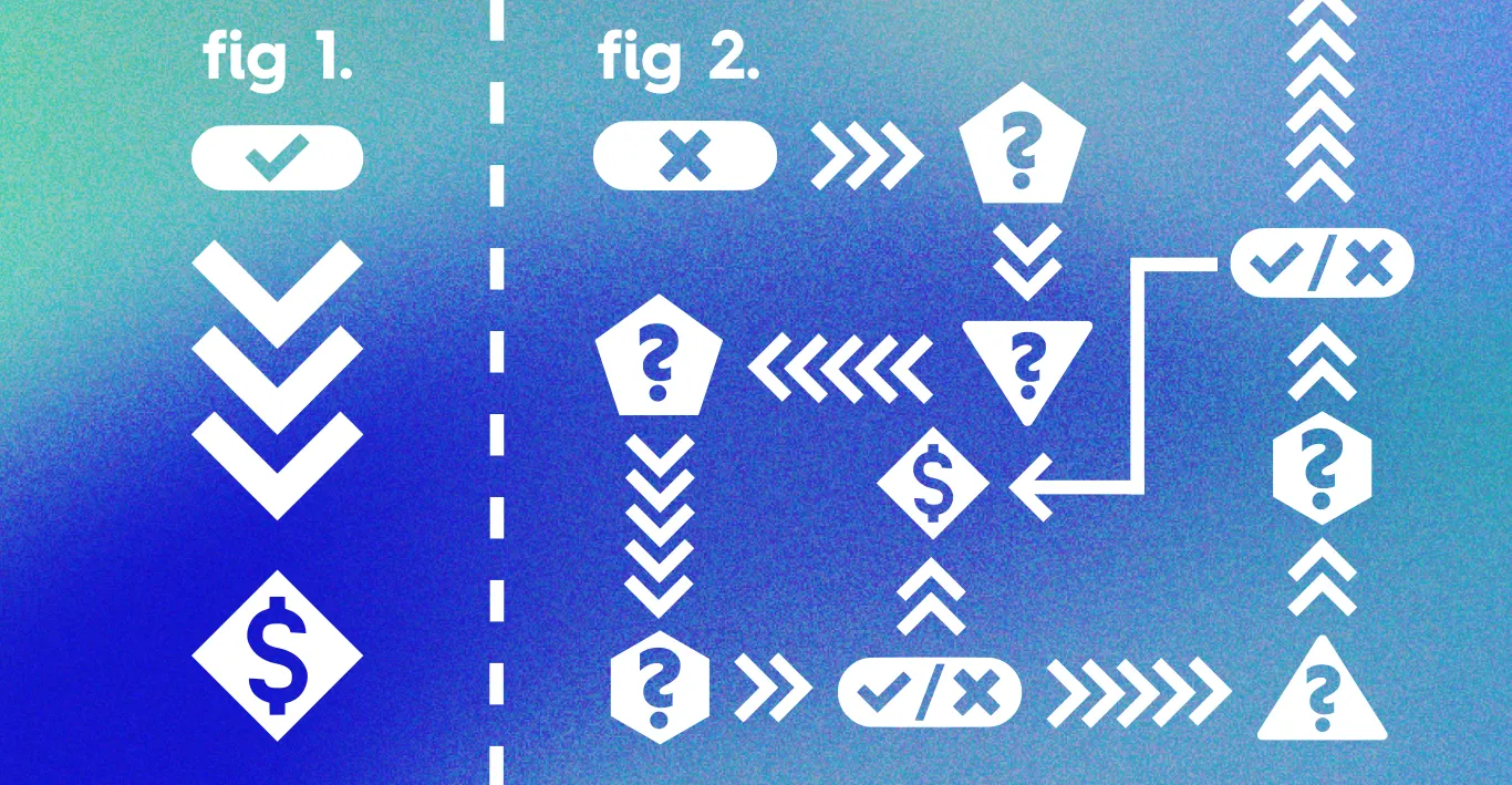
When someone has clicked any of the following buttons - “donate now” or “I’ll help” or “give today” or “support this cause” or any other button that means “I will give you money now” - the ONLY thing they should be seeing is this:
The donation platform.
Otherwise sometimes known as - The payment place. The electronic currency counter. The fields to fill in to follow through on a financial fulfilment.
Once someone has clicked “donate now” they have already been convinced. They have committed. They have decided. They want to give you money.
At this point, trying to convince them further with pretty pictures, quotable moments, clever factoids, shocking statistics, or anything else of that kind, just is not required.
Nonprofits need to understand the notion of talking past the sale. Gilding the lily. Over-decorating the chocolate box.
When someone has clicked the ‘donate now’ button, what you need to be doing is making it as easy as possible for them to fill in their details, confirm their intent to give, and make that donation.
BEFORE they have clicked, then is the time you can be effuse with gratitude, quotes, videos, and other materials. That’s the time you need to use your materials to make a convincing case. Some of it may even be useful afterwards too, as part of your ‘thank you’ messaging and other such materials. But when “Donate now” has been clicked, all you want people to see is the place to provide the proposed donation.
Learn more about the best way to deliver a donation portal - with Everfund
Do you want your potential donors to have that easy, effortless, and effective donor experience?


