For the nonprofit sector, trust is more than important.
It is effectively the next best thing to currency.
On the macro level, the more your nonprofit is trusted, the more seriously your message gets taken, the more influence you have on wider policy. This can bring your nonprofit to the table with local government, national agencies, and even global forums.
On the micro scale, trustworthy behavior becomes better engagement with anyone interacting with your communications. This regard becomes being believed when you say you need something, and ultimately benefits your overall donations.
Trustworthy behavior becomes donor comfort which becomes more donations to further your cause.
So how do you garner more trust? With great difficulty.
Damaging trust is unfortunately painfully easy. Many nonprofits do so regularly, thinking they are helping themselves.
This is very often done through the use of the less wholesome and helpful side of user interface design. Techniques often referred to as ‘Dark Patterns’
What are ‘Dark Patterns’
Dark patterns are subtle UI and UX design techniques that use manipulative methods to make it more likely that a web user will interact with a website in a desired way.
Exactly what is desired will vary depending on the website. Subscribing to a newsletter, reading a certain number of articles, or even paying for a ticket/product/donation.
The methods used are known as ‘dark’ because they often involve deception or manipulation in a fashion that, when noticed, eats away at the web user’s reservoir of trust. For a nonprofit, this is not a lake you want shrinking even slightly towards becoming a desert, which is why you need to be avoiding the following three UI/UX techniques.
They might seem like they’ll make donations more likely, more regular, or more lucrative. All they will actually do is make your nonprofit seem more untrustworthy.
1 - Gratuity atop generosity
Tipping is something that many people come to expect in many areas of in-person service provision, however when it comes to online operations some people do find this process more than a little questionable.
In the area of donation platforms however, there is sometimes a reason for an extra charge that is payable to the platform provider, rather than the charity directly itself. That being processing fees. Everfund makes it very clear what this is and how much it costs. We do this in such a way that in 90% of cases, when presented with the option, donors will elect to cover the costs of processing themselves, ensuring that the nonprofit gets all the intended amount.
However some other companies - including some very famous and well known names - add a suggested tip option to their donation platform. This leads to the invocation of several dark patterns, mainly on the part of the portal itself.
First, there’s the interesting implication that the calculus for donation portal processing fees should be worked out as ‘generosity’ rather than ‘cost’. That’s bad enough.
Second, there’s the issue of how the donation portal’s tipping interface actually works. Some systems will include the graphical user interface tool of a slider. Which would be perfectly reasonable if the slider actually reached zero.
Unfortunately, often in the case of the JustGiving tipping portal system, that isn’t the case. The only way to avoid the ‘voluntary’ tipping system is to deliberately type in a custom amount of ‘£0.00’.
The extra effort necessary to avoid spending more has actually become such a problem for this platform that some of JustGiving’s clientbase have actively had to include explicit warnings on how to avoid tipping. A noble inclusion indeed, but the fact that such a thing was ever needed speaks volumes.
Making it more difficult to avoid paying more money will make your nonprofit look grubby at best, dishonest at worst. You need a platform that makes it clear and certain when you are and are not costing your donors more money.
2 - Longer way back/out
UX and UI designers have a natural and logical interest in making the sign-up or subscription or paying process as easy and seamless and streamlined as possible. The less effort it takes to sign up, the more people will sign up. Thus, the design process makes these things just a matter of one or two clicks, auto-filled in fields, and the smallest number of web page transitions as possible.
This is a perfectly fine and acceptable approach to take looking forward to people signing up. The problem comes when the opposite approach is taken for people looking to cancel etc.
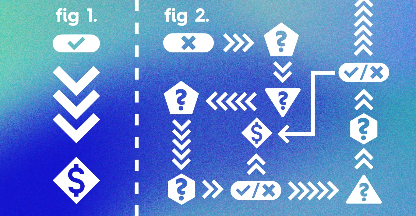
A common dark pattern that emerges across commercial platforms is making unsubscribing or cancelling or generally ending a connection much more difficult than starting one. A large number of check boxes to mark. Several pages to go through. Many different moments of communication and confirmations.
This has become so common among commercial providers that it has its own name. It’s often referred to as the ‘roach motel’, named after the trap designed to ensnare pest insects. Extreme versions of this have included the need to make a phone call with long wait times to unsubscribe, or to print out and post a form ending your connection to a business.
Commercial providers doing this has now become enough of a problem that legislation to fight back against such practices has been introduced at the state level in California under the ‘click-to-cancel’ policy. Given how influential Californian law can be on the wider American online market, and how impactful America is on global internet operations, the potential illegality of roach motel practices is enough of a reason to stop them.
However a much bigger reason is simply undermining trust. If potential donors become aware that your nonprofit treats recurring donations the same way that commercial companies treat subscription customers, they may find you very difficult to trust. Donors will often expect a degree of elevated behaviour from nonprofits. Making it difficult to cancel or unsubscribe will make it look as though you are fighting to hold onto their money/contact information, rather than asking politely.
This doesn’t have to be as complex or elaborate as present in the commercial world. Even the simple practice of trying to find the X button on a donation window can become more complicated if the UX designer slots in an emotive response or a textual plea to be the automated option before a in-window popup can be closed.
3 - Empty camaraderie
It is always encouraging or empowering to feel that you are doing something alongside others. That you are taking part in a cause or event or other occasion that has many people actively supporting it and getting involved.
That sense of shared camaraderie is something that nonprofits around the world bank on in many different ways. All the way from mass sponsored marathons to many different people sharing videos of themselves pouring copious volumes of very cold water over themselves.
However, imagine if you were about to dunk said ice bucket down, only to discover that the six or seven other people who inspired you to do so were in fact paid employees of the nonprofit you were supporting. Not members of the public inspired by the cause. Even worse, what if you found out that all those videos were completely fake. Generated with computer animation to manipulate you into taking part in a ‘viral trend’ that didn’t exist.
Of course, a deception on that scale isn’t something that most nonprofits would seriously consider. AI video generation, while impressive, is not yet at a level where such things could be faked in ways that would be actually convincing. Thank goodness.
However, a method of camaraderie that some non profits are happy to fake is people who have donated ‘right now’ or ‘3m ago’ and other similar timeframes. Popups and other notification style events emerging around the website to convince you that a charity is active, being engaged with, and is receiving the attention of people just like you.
While there is no way to confirm or deny all of these types of posts as true, a little observation makes many of them difficult to believe. Certain names will reappear every time you visit one page, and while many Fatimas and Lucys and John Ss are supporting causes in many places, its interesting they do so exactly three minutes after a new instance of the site appears.
It’s one thing when a company implies that people are ‘buying now’ to generate the buzz they think their product needs. But for nonprofits to lie about donations happening right now is something else entirely. It implies that they need to generate fake ambiance of support which their cause ostensibly lacks. Such willingness to be less than truthful about this, it casts doubt over every other claim they make.
If you want the online audience of your potential donors to trust your proclamations, this is not a pattern you want casting its shadows over your webpages.
Everfund’s transparant alternative
If you want a way to reach your donors with a fast and highly optimised user-experiance that doesn’t cast a shadow over your operational ethics, talk to Everfund today. We don’t do dark patterns, because we know people will happily pay when the costs are upfront and well lit. That’s why we have found 9 in 10 donors who use Everfund are happy to cover transaction costs themselves.
Because we don’t frame them as tips.
Because we don’t send donors on a digital marathon before they can cancel their recurring donations.
Because we don’t show them fake names of fake donors happening in some fake moment somewhere off screen.
At Everfund we believe that a clear and transparent donation platform is the best donation platform.
Speak to us today to learn how much we can do for your nonprofit right now.

